This content was originally published on OldHouseOnline.com and has been republished here as part of a merger between our two businesses. All copy is presented here as it originally appeared there.
This frontispiece from The House Beautiful by Clarence Cook (1878) celebrates the eclectic decoration, tertiary colors, and modern comfort of Aesthetic Movement interiors.
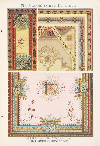
Designs and variants for ceiling decoration, published in The Decorator and Furnisher.
Also look for vintage, chromolithographed trade cards; you’ll find plenty for sale on eBay. The following are in the collection of Eric Holzenberg, director of the Grolier Club in New York City.

In this illustration of 1884, note the repetition of color in papers, furniture, and portiere. The frieze painting continues onto the ceiling.

Gold predominates in an 1883 library.

A famous color plate from Louis C. Tiffany shows a harmonious scheme with wall and ceiling papers, painted wood, and stained glass.
Entire room schemes may be gleaned – not only color palettes, but also motifs, decoration, textile design, and more.

Japanese motifs on two sides of a trade card.

Color cues might come from this travel-agency card.

A German card interprets English Aesthetic taste.
Holzenberg’s collection includes Victorian greeting cards, another source for period color schemes.

Cues for color value, ornament, and Japonesque decoration in a New Year’s greeting card.

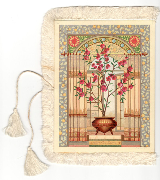
A lovely palette shows up on a tasseled Valentine’s Day card.
The reverse of the Valentine’s card adds rose colors, a strong complement.